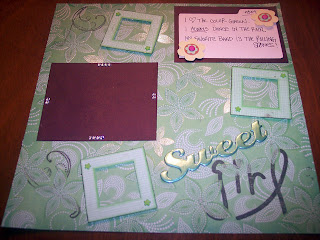
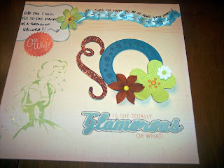
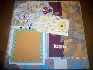


 Ever since my order from Scrap This Kit arrived Monday...I have not been able to put these kits down...I even contimplated sleeping with them under my pillow and if it hadn't been for the delicate laser cut doillie papers, I might have! You absolutely have to check out these kits... http://www.scrapthiskit.com/ they are totally jam-packed with scrap goodies, including a coordinating marker, a never-ending stash of awesome embellies and some totally fabulous etsy finds! Not to mention Tami's great Page Starters, which include some great sketches, patterns and creative prompts to help you...Scrap This Kit!


TIP #1
TRY USING SOLID BACKGROUNDS: Its not always practical to carry a white sheet with you everywhere you go, but for those planned photo shoot, trying taking some with a white sheet in the background...or some other solid color, but white is the easiest. It helps a lot when using your Magic Wand tool in PS or PSE.
TIP #2
USE THE FEATHER and SMOOTH TOOLS: Once your image is selected before extracting try a 1-3 px feather (depending on the size of the image) and a 3-5px smoothing effect(both under the select pull down, under feather and modify), to give your extraction a clean look.
TIP #3
USE THE OUTLINE STROKE TOOL: After you've extracted your image, control click the image layer's thumbnail to load selection, create a new layer and select Outline Stroke under the edit pull down, then select whatever color and a pixel of at least three, or more if you don't want to zoom in(make sure the new layer is selected when this is done), now you should be able to see all those tiny pixels that were missed by the wand. Select the layer image and and erase where the pixels are stroked to clean up your extraction.
TIP #4
ADD A SLIGHT DROP SHADOW: To really make your extraction look like its jumping off the page add a 1 0r 2 pixel drop shadow to give it some depth.
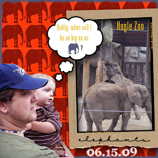
In my layout elephants, I used Katie Perteit's Snap Frame and fonts Karabine and CK love note. The shapes were from Photoshop Elements talk bubble and elephant)

